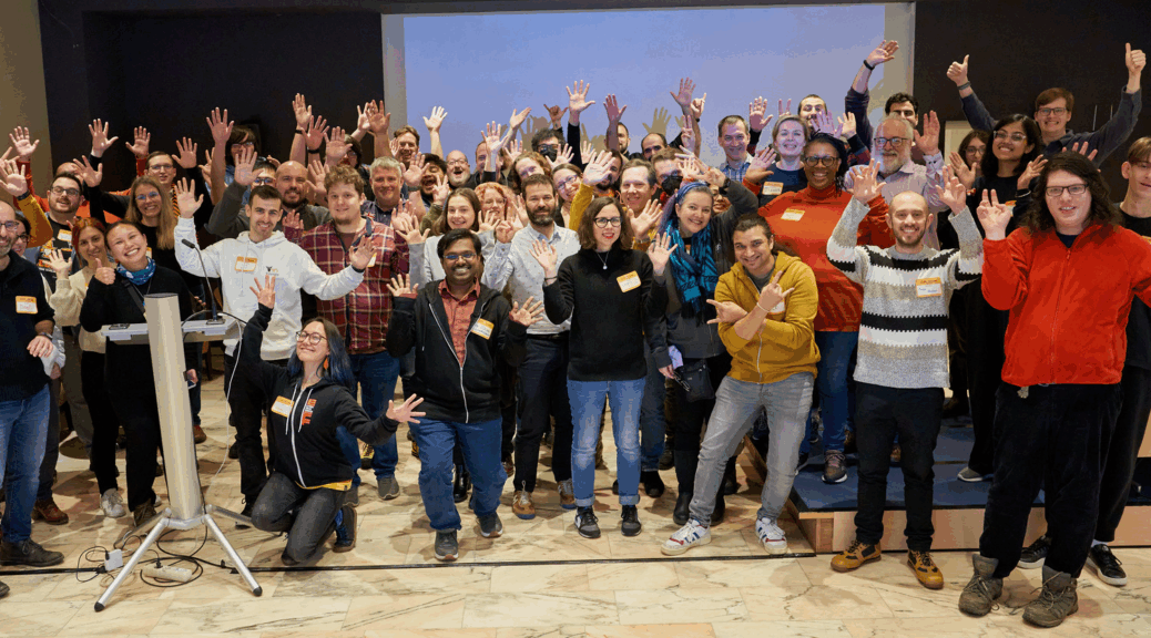
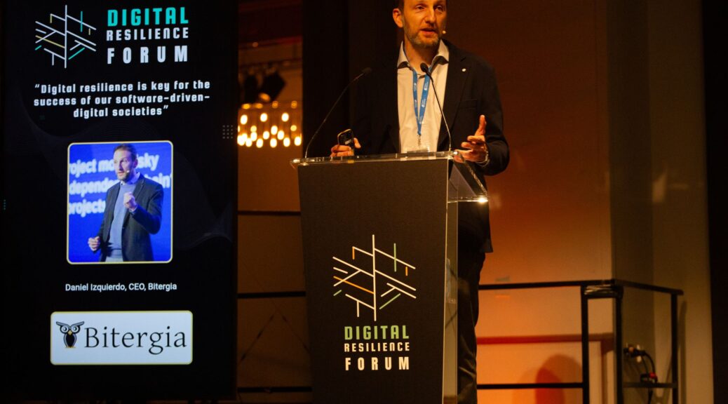
I had the pleasure of attending (and helping organize) the very first Digital Resilience Forum in Madrid, Spain this week where industry leaders, policy makers, governments, and others discussed and collaborated on ways to make our digital infrastructure more sustainable and resilient. Daniel Izquierdo, CEO, Bitergia kicked off the day by talking about how software runs everything and we need to improve the resilience of that software. We always talk about the problems, but this event is focused on sharing how we’re learning and solving the problem of digital resiliency across politics, academia, and industry. Open source allows us to collaborate while increasing digital sovereignty to have more control over our software and infrastructure. Resilience and technological independence is possible if we collaborate and work together using open source software.
“Digital resilience is key for the success of our software-driven digital societies”
The first keynote was from Omar Mohsine, OSS Coordinator, United Nations titled “UN Development Goals: Making Digital Public Infrastructure more Resilient” where he started by talking about the UN Sustainable Development Goals (SDGs). Open source offers us transparency, security, cost-efficiency, sustainability, innovation, and community, and we need technology experts from within our open source communities to help us achieve the UN SDGs. The Global Digital Compact sets out a path toward advancing an open, free, secure, and human centered technology. The UN has 8 open source principles, including open by default, contributing back, and more that were designed for the UN, but now many others have also endorsed them. The UN doesn’t have the funding or resources to achieve all of this on their own, so the rest of us within open source communities need to help by working together. The UN Open Source week is one way to bring all of us together. I attended this event last year, and I’m looking forward to the next one on June 22 – 26, 2026.
John Ellis, President and Head of Product, Codethink had the next keynote, “Why do you trust software? I don’t. (And Why That Matters for Digital Resilience)” where he talked about how software can break the world creating real failures across industries (e.g., recent AWS outage, SolarWinds). Security theater gives us an appearance of security without it actually being secure. We have a trust gap – we built our digital world on speed and features, rather than trust and resilience. The Eclipse TSF (Trustable Software Framework) is designed as a structured path to trustable software with reproducibility, SPDX manifests, zero-trust build pipelines, and automated supply chain traceability along with a FICO-style score for software trust to compare, identify, and underwrite the risks associated with software. This crosses over to make the CRA tangible and help people comply with the CRA. He concluded by saying that we don’t need perfect software, we just need trusted software.
Next up, we had Adriana Groh, CEO, Sovereign Tech Agency (STA) talking about “The Engine Room for Digital Sovereignty”. The STA is focused on solutions to secure and strengthen the open source ecosystem. We have an invisible problem – it may be visible to those of us in the tech industry, but it isn’t to governments and policy makers. Software infrastructure is often overlooked until it breaks, and this invisible problem is how they convinced the German government to fund infrastructure maintenance as part of their digital sovereignty efforts. Digital infrastructure is fragile, but open technologies are the foundation of the modern economy. However, until recently there has been a lack of public investment. This led to the creation of the STA, which is one piece of the puzzle to make sure that OSS continues to be sustainable. They have made 87 investments and over 32 million euros in work commissioned along with a bug bounty program with 32 critical technologies strengthened and over 175 vulnerabilities found. They added a fellowship program with 6 fellows in the 2025 pilot cohort of key maintainers working on multiple open source projects. This isn’t charity – it provides a return on investment to prevent this infrastructure from crumbling while also increasing GDP. They are training a new muscle for the government to encourage them to think of open source infrastructure as something that needs support as a public service in the public interest. Innovation and maintenance are 2 sides of the same coin and you need to support both for long term resilience and sovereignty.
Amanda Brock, CEO, OpenUK and Executive Producer State of Open Con was our next keynote with a talk titled “Digital Sovereignty and Other Fables”. OpenUK is focused on developing UK leadership and global collaboration in open technology. The open source community is the submarine under the UK’s digital economy because we do so much in open technologies as part of global collaboration that people don’t really notice. Amanda talked about her background in law and how she realized that the open source community was her tribe when she worked at Canonical. She melded her love of open source with her background in law when she edited Open Source Law, Policy and Practice (available as open access for free). For her, open source is about global collaboration that includes everyone. The UN principles that Omar talked about take the concept that anyone can use it for any purpose and builds on it. A geopolitical shift has been happening with Brexit being one part of it, and OpenUK was created in part because the UK was being excluded from EU efforts. Digital sovereignty refers to the ability to have control over your own destiny across the data, hardware, and software that you rely on. In the UK, sovereignty is discussed as not being isolationist, but as being collaborative. We need to bring together the best innovation, intelligence, and collaboration to serve our own countries, but we can build this through global collaboration. You need open source as part of a sovereignty strategy, but these projects are built via global collaboration, not as isolated projects. She concluded by saying that open source is not local source, it’s a global collaboration.
The final keynote came from Tanu Sahnan, Head of Software Engineering, BBC talking about “The Digital History of the BBC”. England’s world cup opener in Nov 2022 was the moment that tested the BBC, but resilience isn’t about surviving a crisis, it’s about learning and improving. The BBC values include trust, and the BBC has a public service mission, so they build in-house using open source for digital sovereignty with innovation, ethics, and inclusion while scaling to millions of daily users with a global impact. The BBC uses a responsible, trusted and human-centered approach to AI with efficiency, new capabilities, and trust / responsibility, not about chasing AI trends.
We also had a number of very interesting panels and workshops, including the one that Ana Jiménez Santamaría and I led titled “Kick-starting your OSPO: a practical approach”. I’m only covering the keynotes in detail here because there was just too much amazing content to include all of it, but you’re in luck because pictures and videos from the day should be available soon on the Digital Resilience Forum website.
