Category Archives: tags

World (Portland) Explorer Tag Maps Courtesy of Flickr Data

I read about the new World Explorer from Yahoo today on O’Reilly Radar, and I decided to take a quick look at the map for Portland. A few interesting things turned up when I moused over some of the main tags to see the related tags.

  • The “Zoo” tag was fairly predictable: giraffe, animals, bear, etc.

  • “Edgefield” was related to McMenamins (not surprising since the Edgefield McMenamins is a very popular destination.)

  • OSCON was on the Portland map as a tag.

  • Beaverton, a sleepy and not always very nice suburb of Portland, relates to sunset, clouds, and sky – I can’t even hazard a guess on that one.

  • The most interesting: Mt. Tabor was only associated with cat. Apparently “cat people” gravitate toward Mt. Tabor.

I also noticed that going back to the map after closing my browser yielded slightly different results. I encourage you to have a look. It provided me with a few minutes of amusement anyway.

New Netvibes Update

Netvibes just released a new update (code named Cinnamon) with new features, new modules, and a better user interface.

I have been using Netvibes for a couple of months, and I use it constantly. I tried more RSS readers than I can count, and I hated all of them. Prior to Netvibes, I could not find any RSS readers that worked better than than the RSS functionality built into Firefox. The beauty of Netvibes is that they manage to cram a bunch of feeds on the screen, but organize it in a way that never seems overwhelming or cluttered. I can see all of the posts from more than a dozen blogs without scrolling, mouse-overs give me the first couple of sentences, and I can chose to read any post within the Netvibes interface or natively as a new tab in Firefox. Almost everything is configurable; I can have multiple tabs; and the content is easily organized by dragging and dropping.

Netvibes has also integrated a number of very useful modules. Michael Arrington uses it daily for one stop access to a variety of web services. I can see my unread Gmail messages, my delicious bookmarks (including sort by tags), the front page stories on Digg, the weather and more from a single page.

The best part is that I rarely have to wait on anything. Quick, configurable, intuitive, and easy to use … everything I want in a web app.

Web 2.0 Exit Strategies

Marco Rosella has an interesting idea about how companies can promote their exit strategies at the upcoming Web 2.0 Conference … (Note – this is meant to be humorous):

“The success of a new service, if really demonstrated itself different from all the others, however could decree the end: where there’s a lack of Venture Capitals and/or the ads are to cover the band costs, naturally proportional to the traffic, the only reason of survival remains the sell to a big company.

As we know by now, Web 2.0 web application’s interfaces have their peculiar style defined by reflections, fades, drop-shadows, strong colors, rounded corners and star badges, these standing out in the header of every homepage.

Badges are the key element of this kind of design, being the first to flash user eyes, and so extremely important for the right communication of a message with fundamental importance.

Below you’ll find some example badges, arranged in four incremental levels, each one related to a different business model.” (Quote from Central Scrutinizer)

This is a humorous way to portray the current environment; however, it highlights a serious issue facing web 2.0 companies. With so many new web 2.0 companies, it becomes difficult to stand out in the crowd. Not all of them are looking to rise above the crowd in order to exit the business, but even getting mindshare with users can be difficult. Those that succeed in growing a large user base tend to do so virally, YouTube / MySpace / del.icio.us / etc., which is difficult to predict. Web 2.0 companies will need to focus on finding ways to get attention. Maybe the acquire me badges are not such a bad idea 🙂

Remember The Milk

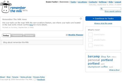
I have been trying to get my personal life just a bit more organized, so I decided to try a web-based task manager. Based on a TechCrunch review of online to do lists, I decided give Remember The Milk a try. As a bonus, the company is also partially run by a stuffed monkey.

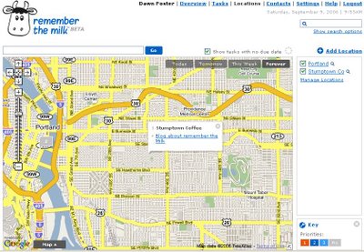
Remember The Milk has all of the cool web 2.0 features. You can tag your tasks and view them in a tag cloud if you just want to see tasks related to a specific tag or get a feel for which tags have the most tasks associated with them to see where you are spending your time. It also has a cool location feature where you can give each task a location and see them all together on a map. This could be great for someone planning sales calls or deciding how to most efficiently run a bunch of errands spread across the city.


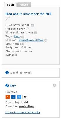
You can associate notes, URLs, time estimates, due dates (single or repeating), priorities and more with each individual task. You can put all of your tasks together or spread them among several different lists to separate personal, work, and other types of tasks. Reminders can be sent to via email, IM, Skype, mobile phone, and other methods to make sure that you never forget a task.

The only thing that does not seem to work well is the RSS feeds. Netvibes will not recognize the feed at all and when I use the Firefox live bookmarks each task has a name like “2006-09-09T16:16:40Z” … not particularly helpful.

So far, Remember The Milk seems to be a good tool for managing my tasks despite the issues with the RSS feed.